
Heat Maps: Visualizing Accessibility with Geospatial Technology

When I first started working in global health supply chains, one of the most challenging questions stakeholders faced was deceptively simple: "How do we know if people can actually reach the services being provided by those supply chains?" There was no easy way to figure out how many people were forced to walk more than one or two hours to receive these services, which impacts broader health outcomes.
This fundamental question of access and reach used to require sending teams into the field for weeks at a time, hiring expensive consultants, or relying on GIS specialists to create complex custom analyses that drained time and resources. But what if we could see these accessibility patterns instantly, with just a few clicks? That's exactly what we've built.
Today, I'm excited to kick off a new series exploring the key features of the Crosscut app, starting with one of our most powerful visualization tools: accessibility heat maps.
Visualizing Access: What Standard Maps Miss
The accessibility heat maps we built are visual representations that show how long it takes to reach different areas from a specific point.
While a standard map might show you where points are located, it doesn't account for everything standing in the way: bodies of water, road quality, topography, and more. A 5-mile distance could mean very different things. Accessibility heat maps reveal not just distance but actual travel time by color-coding areas based on accessibility to a specified point.
At its core, this feature helps answer critical questions:
- Which communities are too far from service points to realistically access them?
- How many people live beyond a reasonable travel distance?
- Where should we place new service locations for maximum accessibility?
Beyond health services, any organization needing to understand who they can reach—whether you're distributing products, providing services, or planning infrastructure–benefits from simplified accessibility maps that non-technical users can understand.

How Crosscut Accessibility Heat Maps Work
When you create an accessibility heat map in the Crosscut app, our geospatial mapping system analyzes multiple layers of data to calculate realistic travel times across any terrain:
- Road networks - including highways, local roads, and pathways
- Elevation - uphill travel takes longer than flat terrain
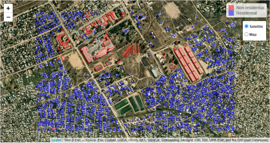
- Structure distribution - where and how many buildings in the area
- Land cover - movement through forests differs from open fields
- Water bodies - rivers and lakes create natural barriers
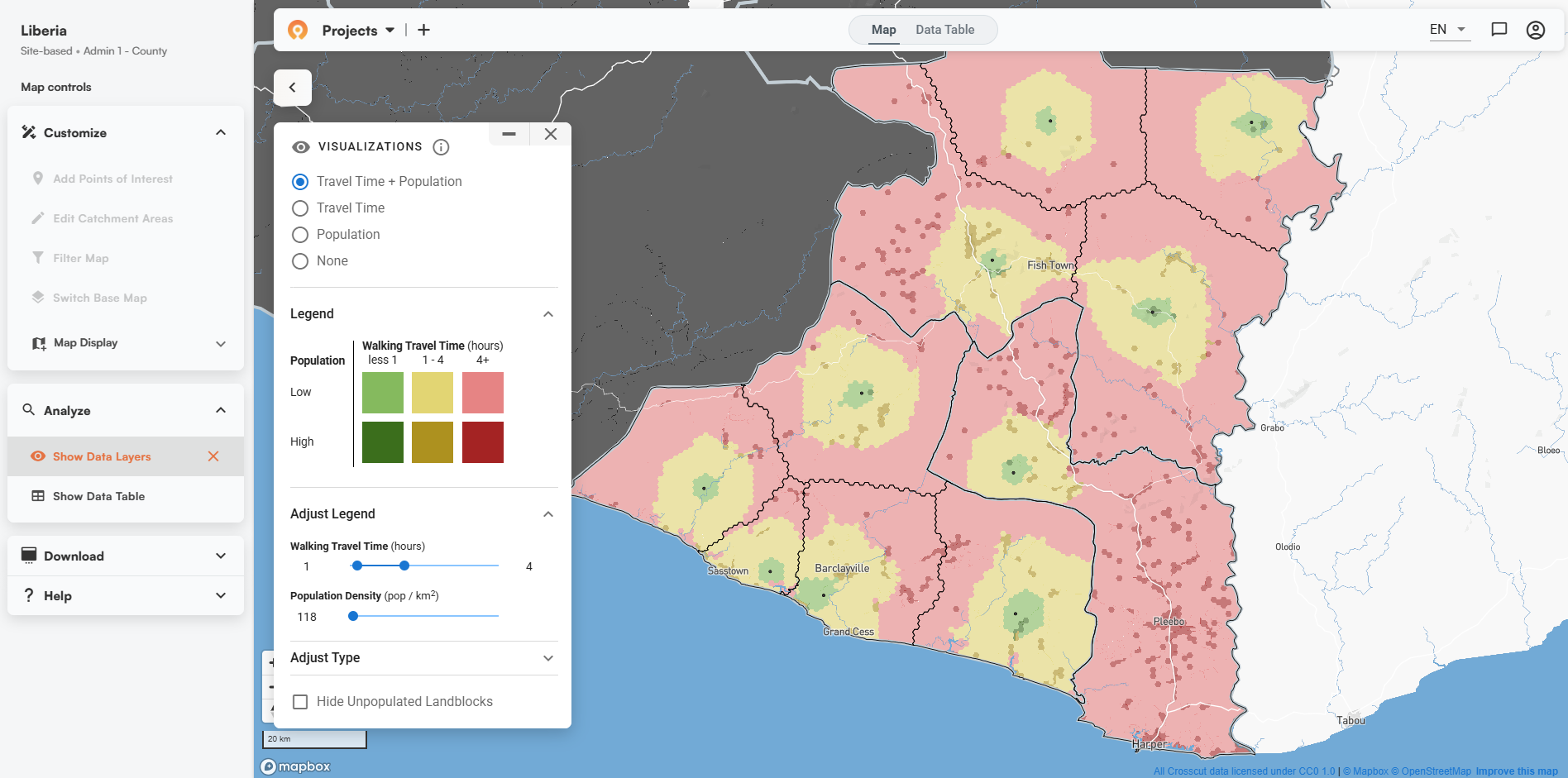
This is where the color-coded heatmap shows travel times to or from any point. Red areas indicate locations that take longer to reach, yellow is slightly more accessible, and green areas are the most accessible locations.
What makes this cool is how easily you can manipulate the visualization. With simple slider controls that are easy to learn and apply to your data, you can:
- Adjust between walking or driving times
- Set specific time thresholds (1 hour, 2 hours, etc.)
- Toggle population overlays to see how many people live in each zone
- Combine travel time with population density to identify high-priority areas
Watch How It Works
Set a health facility point, and watch as our app reveals walking times and population density. These red areas aren't empty. They're home to communities that might need mobile clinics or new health facilities. By adjusting the travel time slider, we instantly see potential service gaps.

In just seconds, our app uncovers critical insights that traditional mapping can't communicate. You can even segment population data by age and gender in many countries to get more granular—a feature we'll explore in detail in a future post.
Making Big Data Accessible to Everyone
As we’ve expanded into 43 countries and counting, one of our core missions has been democratizing access to complex geospatial analysis. Big data is notoriously hard to handle, especially with geospatial datasets that cover entire countries.
But that's exactly the problem we've solved. No expensive consultants and no specialized GIS training required. Analytical capabilities that took weeks of work and high costs are now available instantly through a free, intuitive interface without any coding or data analysis needed.
Accessibility in Low-Resource Settings
Travel time analysis becomes particularly valuable in settings where infrastructure is limited or information is scarce. In many developing regions:
- Roads and waterways may be seasonal or informal
- Public transportation might be inconsistent
- Geographic barriers like rivers or mountains significantly impact accessibility
- Population data may be outdated or incomplete
At Crosscut, we address these challenges head-on by incorporating the latest satellite data, road network information, and population estimates.
More Real-World Applications
One of my favorite examples comes from Northern Ghana, where a regional health officer mapped out service zones using Crosscut and discovered entire communities that were over two hours from the nearest clinic. Seeing those red zones on the map led directly to better-targeted outreach and new facility planning.
Beyond public health, accessibility heat maps are a thing. There are other real-world applications outside of health:
- Retail Networks: Determining optimal locations for new stores or service centers
- Agriculture: Planning collection points for smallholder farmers' produce
- Education: Analyzing student access to schools and targeting transportation support
Minutes Not Miles: The Crosscut Difference
It's not just about miles when you’re optimizing a supply chain. It's about minutes. What sets the Crosscut app apart is how we've simplified complex geospatial analysis into an intuitive interface anyone can use.
Traditional methods typically involve:
- Collecting multiple datasets from different sources
- Cleaning, harmonizing, and consolidating data from across sources
- Building complex models in specialized GIS software
- Having technical experts interpret the results
With Crosscut, you can:
- Quickly generate catchment area maps
- Click "Analyze"
- Choose "Travel Time"
- Immediately see the results
You don’t need to hire data analysts—and no waiting weeks for analysis to be completed.
Identifying Critical Service Gaps
One of the most valuable insights from these visualizations is seeing not just which areas are hard to reach but how many people live in those areas.
As we saw in the video, by toggling between views or adjusting the time thresholds, you can quickly identify high-priority regions. The Crosscut App “lights up” spots on the map that are both far from a service point AND have a sizeable population, making them good targets for outreach/expansion.

From Free App to Custom Solutions
While the Crosscut app is free to use, we know some organizations need more personalized options. In my post about our DHIS2 journey (the national health data system used in over 100 countries), I talked about how we help countries build this functionality right into their national systems. We've done similar work with WHO's ESPEN program, creating custom versions of our technology that plug directly into their widely used platforms.
Our advisory services build solutions to match your organization’s exact needs, from custom integrations to unique data layers and advanced analytics dashboards. It's the same core tech that drives our free app, just configured specifically for your organization's specific needs.
Looking Ahead
In future articles in this series, I'll explore other powerful features of the Crosscut App, including:
- How to edit catchment areas for more precise planning
- Ways to benchmark population estimates across multiple sources
- Techniques for creating perfect operational maps
In the meantime, I encourage you to try the travel time feature yourself. The Crosscut App is free to use at crosscut.io, and we're constantly adding new countries and features.
If you're working in a field where understanding accessibility could improve your operations—whether in public health, retail, logistics, or beyond—I'd love to hear about your challenges and how geospatial insights might help solve them.
Related Posts
Loamin x Crosscut: Modernizing Malaria Prevention with Geospatial Maps


How AI Is Impacting Our Work
.JPG)
Microplanning for Malaria Control
