
Making Community Health Planning and Services (CHPS) zones in Ghana

Last week, I was lucky to have a great conversation with Fuseini Mahama, a Regional Disease Control Officer and field epidemiologist working with the Ministry of Health in the Northern Region of Ghana. Fuseini took the opportunity to generously share the details behind how he is using the Crosscut app to support his work and how GIS based microplanning can positively impact the lives of children and families in hard-to-reach areas.
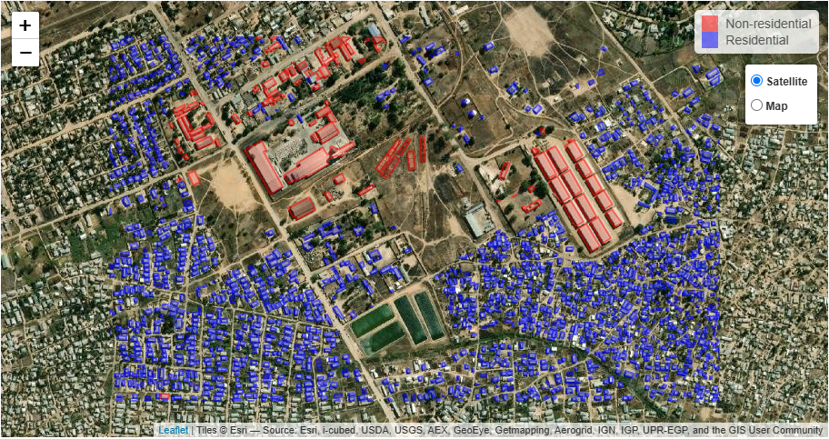
Fuseini is using the Crosscut app to carve Ghana’s Northern Region into Community Health Planning and Services (CHPS) zones. The main purpose behind these zones is to ensure that every single child and family has access to primary healthcare services, including routine immunizations, antenatal care, and midwives to assist with deliveries. In short, they are a tool to make sure that basic health services are sent to the doorsteps of the community.
In order to start the process of developing these zones, Fuseini first turned to the open source GIS application QGIS. However, he soon found that the outputs he produced weren’t quite what he was looking for, and that there was no easy way to generate catchment areas in QGIS that took into account population distributions, geography, and other concerns. After searching around for GIS tools for microplanning, he came across the Crosscut app, and was impressed by the results. In particular, he was happy with how easy it was to get started, the different visualization options (particularly the walking time visualization), and the ability to manually edit the resulting catchment areas.
When discussing the power of GIS-based analytics to produce catchment areas like CHPS zones, Fuseini highlighted the ability for these techniques to produce more granular insights into the coverage of health services than traditional approaches. Before GIS analyses were more accessible, health programs had to collect inputs from community volunteers in order to assign individual communities to health facilities. Coordinators would then need to manually conduct registrations within communities in order to build a database describing the population to be served. With GIS population data, on the other hand, planners are able to much more quickly see which areas are populated versus those that are not, which enables them to accurately target follow-up data collection efforts and ensure that limited resources are allocated efficiently.
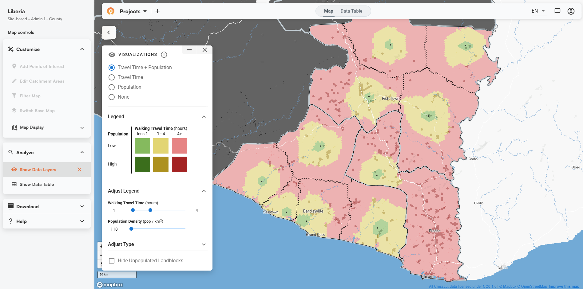
On the topic of population distributions, a core feature of the Crosscut app that Fuseini has been leveraging is the visualization that combines population density with walking travel time. This view allows the user to quickly see which populated areas of a given catchment area are more than a specified number of hours from their assigned facility. Fuseini took this a step further by uploading his own geocoded community locations, which allowed him to see the populations that were at risk of being underserved within each CHPS zone based on the population data pre-loaded into the app as well as his own data.

Seeing these populations at risk of being underserved due to geographic accessibility is much more than an interesting datapoint. As Fuseini puts it, having an easy to understand map that highlights these problems makes it much more likely that authorities will make necessary investments to reach families in these areas. The fastest intervention that Fuseini’s colleagues will make to serve these inaccessible areas is to set up outreach points where medical personnel can provide services according to a limited schedule. On a longer term, he and his colleagues will be collaborating with local authorities to build additional health facilities in the areas most impacted by accessibility problems. These conversations can be greatly enhanced by having visualizations like the ones that Fuseini is producing–these visuals help authorities understand the reality faced by people living in these areas and can make the case that such investments would actually make a concrete difference in the lives of the people being served.
A big thanks to Fuseini for using his valuable time to fill me in on his work and to share the practical impacts that GIS-based microplanning can have. I always love to learn more about how people are using our app. If you would like to share anything about your own work with our tools, please send an email to james@crosscut.io. Thanks for taking the time to read this, and I hope to hear from you!
Related Posts
Loamin x Crosscut: Modernizing Malaria Prevention with Geospatial Maps

How AI Is Impacting Our Work
.JPG)
Microplanning for Malaria Control
